Print component
Another of the main components of the project is the print components. For the short film, this is a postcard that would be given out during Film Festival. For this component, my group and I did some research and looked at student samples and short film samples These postcards should include the name of the production, director, time and date of shows, and contact/ social media information. We are still not sure how we will make the postcards but we do have ideas of what we don't want in them.
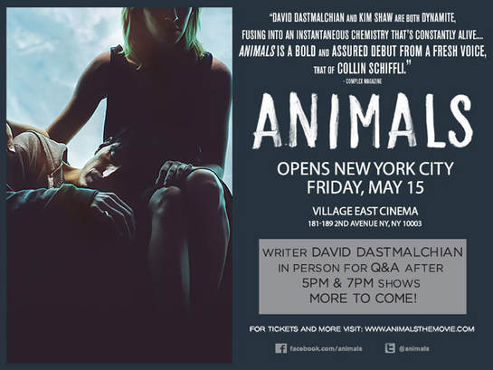
This is one of the Postcards that I found online for a short film shown in festivals. For this card I was only able to find the front of the postcard, usually, postcards have a front and back (which will make sure to make). This is clearly for a film called "Animals" as it's the biggest word on the card. Under the name, it's the date, time, and location of where it's going to be shown. The card also has all the production credits in the upper part of the card in small letters and in the bottom social media accounts of the production, also in small font. It also includes a snapshot from the film that helps sets the mood for the overall production. From these postcards, the thing that really stuck out to me is the color scheme. How the letters, photos, and background color all go together. It helps to make the card easy to look at as well as captivating as the colors go really well together. We definitely want to include a prominent color scheme in our card, to reflect our color scheme in our movie.
For color schemes, I had an idea to make the front with lots of colors and the back in black and white. As in our production, we are going to be playing with the saturation of the shots. Lowering it when there's a sad part, and bringing it up in the shots when there is a happy scene. By including this in the postcard I feel like it makes it very unique as well as captivating to the viewer.
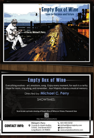
This sample is also from another production show in film festivals called "Empty Box of Wine". This one is more like what we are supposed to produce by having the front and back of the card. The Front of the card has minimal text as the focus of it is mainly on the image. Also in the front is the production title, catchphrase, and director's name, however, the most eye-catching is the picture with the bright colors and unique character, because the words are in a smaller font. This helps to captivate the audience through a visual point. On the back of the card is where most of the information like the movie description, Showtimes, and contact info. I think this is a good way to organize the postcard so that the viewer is caught through the visual factors and the aesthetic of the movie. However, this might be overwhelming to the viewer depending on how much information there is and only having all of it in the back. It might seem like a lot of organized wrongs, which will have to be careful with.

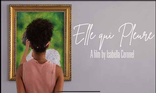
This example is from a student-produced film called "Elle qui Please". In my opinion, this one is the best visually as it has a consistent color palette with the purple, pinks, whites, and greys that are prominent in the front and back of the card. This is something that I definitely want to include in our postcard having a pattern with color in the cards. I feel like it's an easy way to make the cards consistent and easy for the eye. The front of the card only includes the title director and a snapshot from the short film. The front part is very simple, but pretty at the same time. As well the font and color palette helps inform the audience about the aesthetic of the film. On the back, the card includes a short description of the film, title, production credits, and contact information. Something really clever that the creator include was a QR code for the Youtube and Instagram accounts of the production. I feel like this is an easier way for people to find the social media accounts of the movies, and will definitely consider including something similar.


This is another student-produced film "How fast". The most prominent thing in the cards is clearly the color red. It has a very prominent red presence which is most likely reflected in the film. On the front of the card are the title, catchphrase, location, and time for viewing. The title isn't written on the card, instead is in the picture, which is a clever way to include it however it is easy to miss and many people could be confused about what the title is. On the back of the card, there's a quote and contact information for the movie and where to find it. This whole postcard is missing production credits, which is a detail that all postcards include. My group really enjoys the prominent color and how its consistent and would most likely include something similar in ours
<33


No comments:
Post a Comment